2020 in Chinese lunar months
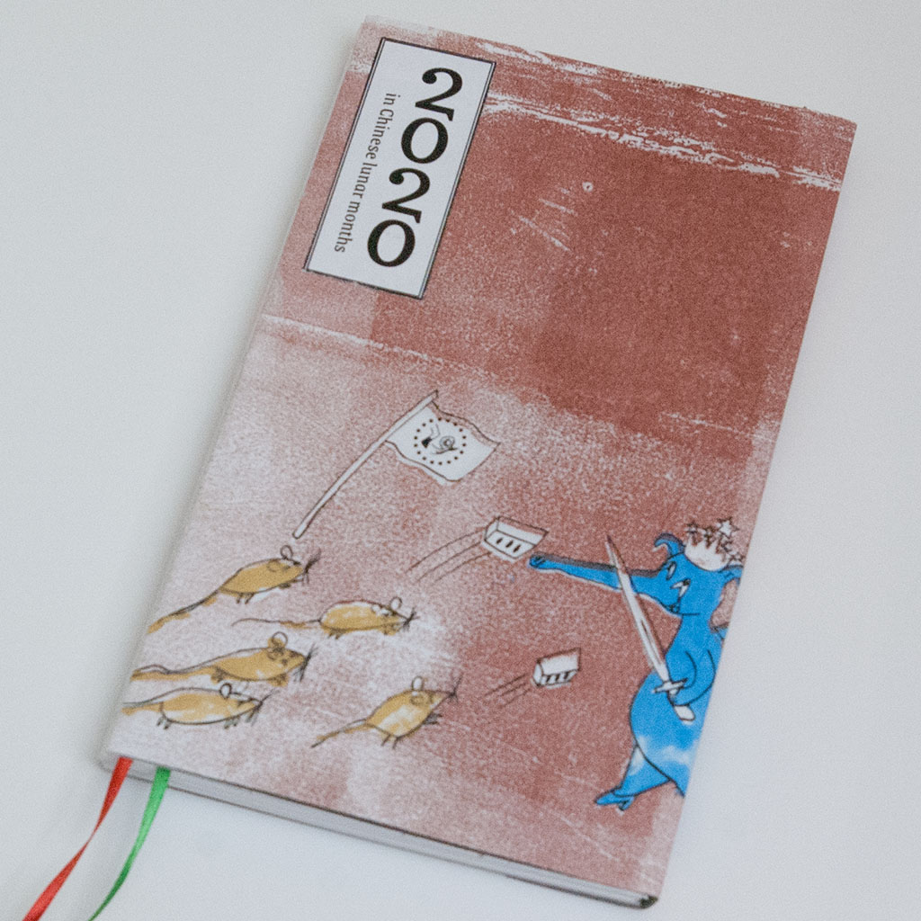
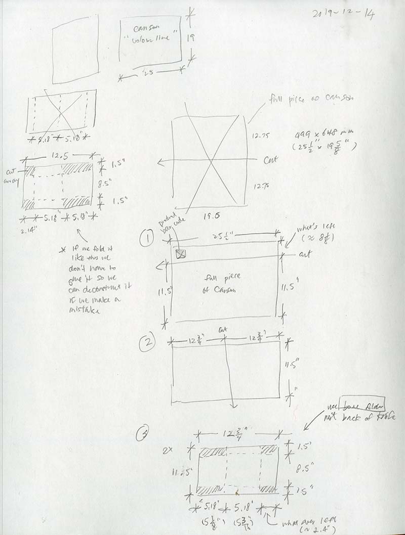
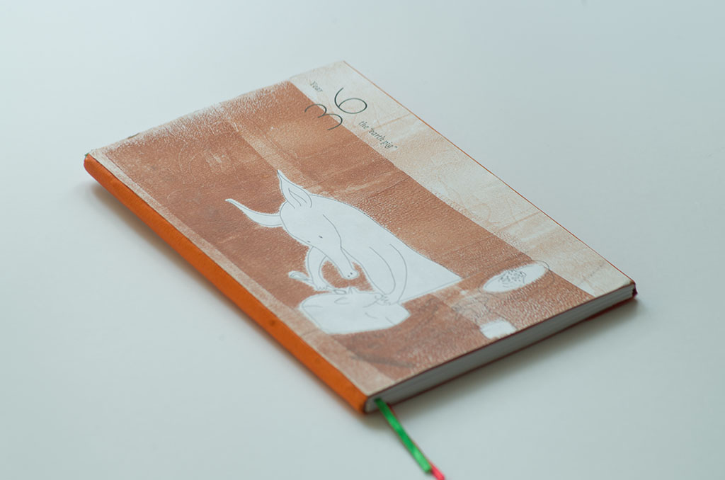
I remember calendars in my childhood — pocket calendars, desk calendars, wall calendars, and of course organizers. They all had Western dates printed in big letters, then near them, Chinese dates[Note 1] printed in small or even tiny print.
Chinese dates aren’t important after all, except when you need to know the date of some traditional festival. As little kids, all we probably knew was the dates of all these festivals shifted around.
How would it feel to have the experience reversed, to have Chinese dates in big letters but “normal” Western dates in small print, to have Chinese festivals fixed but our Canadian holidays shifting around? In other words, what if the Western system did not win?
Will such an organizer be too awkward for us? Or still useful?
Attack of the Zombie Blue Aardvarks and the Return of Totalitarianism
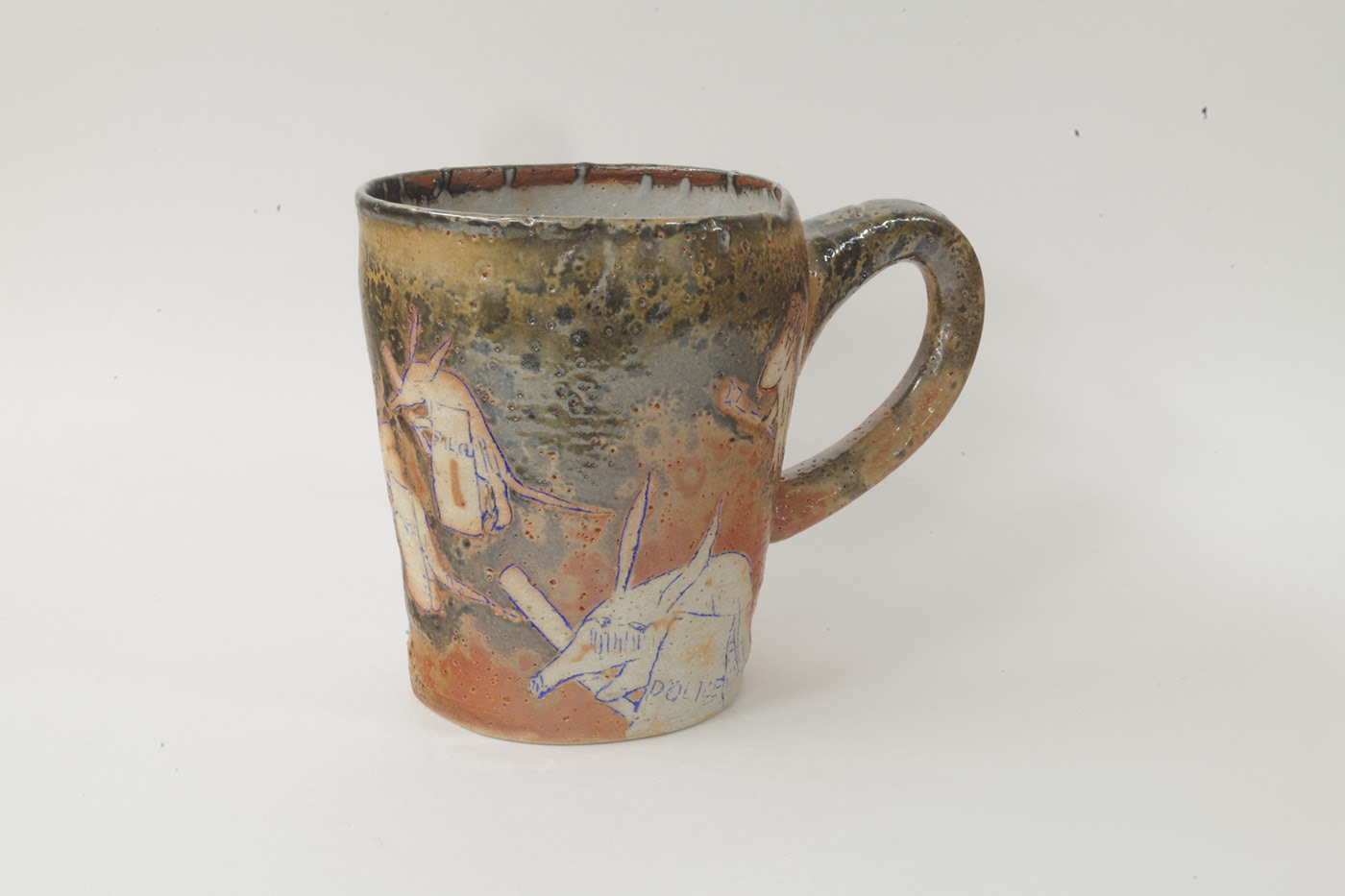
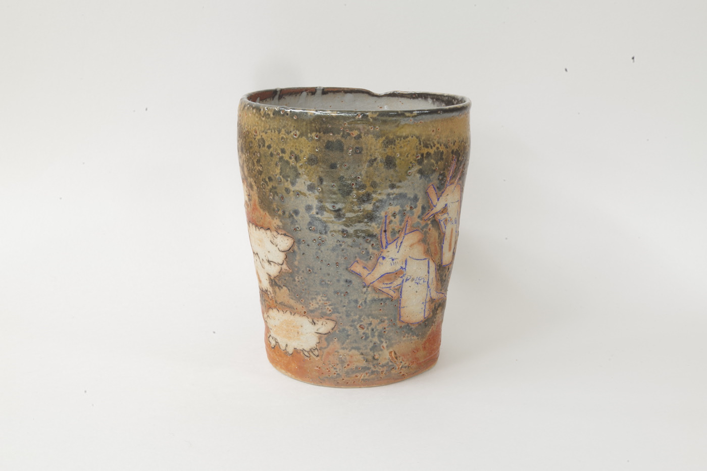
On Copyediting-l, a mailing list used by copy editors, people used to have the custom of disguising information that should not be divulged with references to aardvarks. I borrowed the idea and used aardvarks to suggest a subject that might be considered confidential, undivulgeable, taboo: police brutality.
In 2014, police in Hong Kong started acting irrationally. It felt like they had become zombies, and in 2015 I expressed this feeling in a blog post with the cryptic reference Attack of the Zombie Blue Aardvarks and the Return of Totalitarianism. When I expressed the same feeling in an image the next year, I could not but use the same reference to name my work.
Things have now devolved to a level far worse than what happened in 2014.
Untitled (ceramics display)
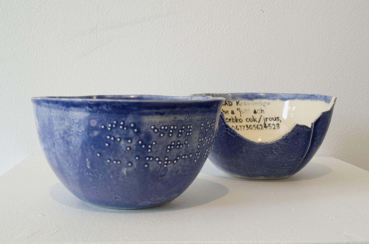
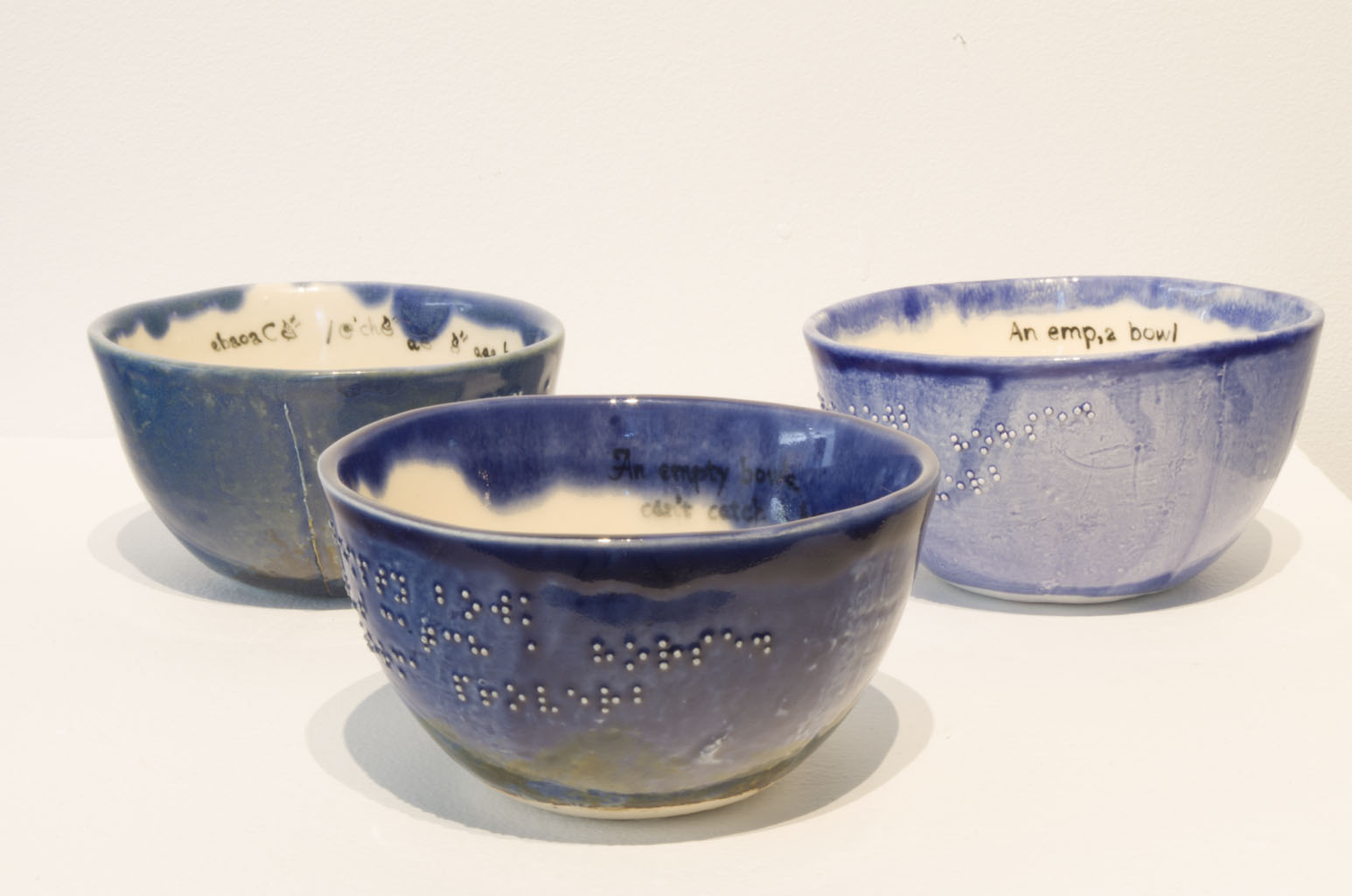
When I did my thesis I discovered that braille dots on leather-hard bowls could fall off. Rather than discarding the defective casts, I decided to transcribe what the defective braille would have said if a blind person tried to read it.
I felt brailling was like translation, and if we don’t correct the mistakes, who would know? (After all, an exhibition I saw at The Power Plant, in 2013, had the wrong braille and I bet no one else noticed.) But I thought these errors should be exposed for what they are, in a form that sighted people can understand.
I glazed all these defective pieces blue, because it’s “blue” for us to not care if the messaging isn’t coming across.
Hi!
My name is Ambrose and I’m a visual artist, graphic designer and word tinkerer based in Toronto, Canada.
I am a settler, but my birthplace has become a colony where our treaty rights are being trampled on and our way of life is being dismantled. My feelings for my birthplace inform some of my work.
How to reach me
- Email:
- ambrose.li@protonmail.com
- Instagram:
- @ambrose.li
Toronto is in Canada’s “Eastern” time zone, which is currently 4 hours behind Greenwich Mean Time (GMT−4).
© 2020–2024 Ambrose Li
Designed and coded by Ambrose Li.
First published .
Last updated .
Special thanks to:
We #StandWithUkraine Portrait Studio Pop-up and Anita Kin
Colophon
Typeset in Lato, a typeface designed by Łukasz Dziedzic of tyPoland, Poland. Some icons typeset in Open Iconic, an icon set designed by P.J. Onori, Dave Johnson and Ryan Teuscher of Waybury, United States.
Webfonts delivered with Brick, an open-source webfont service designed by Alfred Xing, Canada.
Accessibility statement
This site has been tested for keyboard navigation and with the TalkBack screen reader on Android, although this site is not currently required to comply with WCAG AA in Ontario.
Colour contrast on this site is currently not compliant with WCAG Level AA; this will eventually be mitigated but please read my thoughts on problems with the colour contrast rules.
